Hello and welcome to another Memory Makers Magazine Blog Bounce!
This month, we're showcasing our favorite treats! You may have just hopped on over from Michelle Coleman's blog, but if not... don't worry! You can continue on through my blog, or you can start from the Memory Makers Magazine blog. Hope you enjoy the blog bounce!
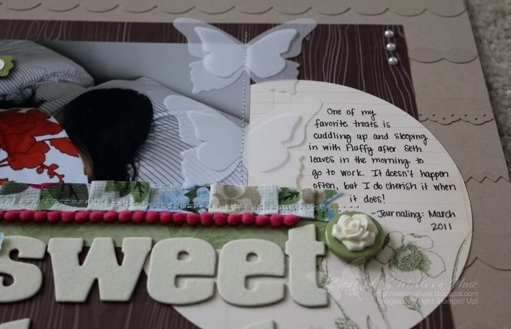
One of my favorite treats is sleeping in with Fluffy. Usually we try and sneak in an extra 30-45 minutes or so of snooze time after Seth leaves in the morning to his research lab at the University of Tennessee. Seth generally gets Fluffy breakfast (she eats 3x a day like a human) when he gets up, then she loves to take a nap after that! She makes sure he remembers, too. :) What's funny though, is that it's almost always hard for me to get Fluffy up after this nap. She just doesn't want to get up! Such a sweet little lazy thing. LOL
It was quite the challenge to get this picture, setting up our tripod and self-timer. There were so many hilarious outtakes, what with Fluffy's crazy expressions and all! I'm sure she thought I was absolutely insane, taking pictures of us "sleeping".. hehe!
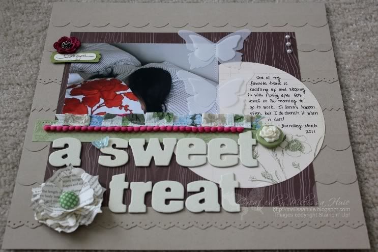
I'm super happy with my page! Definitely one of my favorites. :) I've created a background with border strips before, but only on a card.. this was my first time trying it out on a scrapbook page. I used the Tasteful Trim Bigz XL die from Stampin' Up!, as well as the Eyelet Border punch. The purple crochet flower at the top started out white, and I dyed it using the Rich Razzleberry classic ink refill, diluted with water. Love how that turned out! The large circle on the right was cut from the beautiful Botanical Gazette Designer Series Paper with the Circle Scissors Plus (6" circle), and it was the perfect journaling area.
Aren't the butterflies sweet? I cut them out of vellum paper (thinner than the vellum cardstock) with the Beautiful Butterflies SU! die. I wanted to create a light, airy look, so I sewed them to the layout. I love how the vanilla flower adornment looks with the big button here - just like a cameo! And if you didn't already realize how much I love the pompom trim.. well, I just wish SU! came out with it in so many more colors!
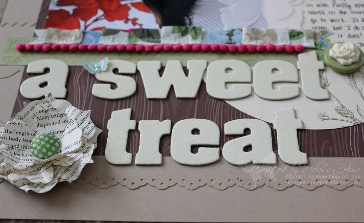
Here are a couple more shots to show you the details and layers (click to see a larger photo):
The flower here at the bottom was created using the Fun Flowers SU! die - I crinkled up multiple layers and added a fun fabric brad in the middle.
Ok, your next stop is Wendy Smedley's blog, which can be found here. I can't wait to see what her favorite treat is! Thanks so much for stopping by!
All supplies are by Stampin' Up!
Stamps: Short & Sweet, Clearly for You
Ink: Chocolate Chip, Baja Breeze, and Very Vanilla Craft ink, Rich Razzleberry Classic ink refill
Paper: Crumb Cake, Old Olive, and Very Vanilla cardstock, First Edition Specialty Designer Series Paper, Botanical Gazette Designer Series Paper, Woodland Walk Designer Series Paper, Vellum Paper
Accessories/Tools: Springtime Vintage Designer Fabric, Melon Mambo Pompom Trim, Fleurettes II Accents & Elements, Vintage Flower Adornment, Springtime Vintage Big Designer Button, Pearl Basic Jewels, Antique Brad, Sweet Stitches Fabric Brad, Alphabet Soup Chipboard Letters, Eyelet Border, Word Window and Modern Label Punches, Fun Flowers Bigz Die, Beautiful Butterflies Bigz Die, Tasteful Trim Bigz XL Die, Big Shot, Circle Scissors Plus & glass mat, sewing machine and thread




This is a beautiful LO! love the butterflies and flower.
ReplyDeleteSuper duper, Melissa!! What great color combos!! Love the pompoms the butterflies and the print flower. Remember when you didn't sew on LO's? Love that you do. This is gorgeous!!
ReplyDeleteOh I just love this layout! I really want to try the creating the background with border strips. It just looks so wonderful! I must get that die! haha The flower is too cute..love the bursts of color you've got throughout the layout and I just want to touch the butterflies!
ReplyDeletesuper cute! i LOVE what you have done! :)
ReplyDeleteThis is wonderful. I love the subject matter and especially the little note about Fluffy wondering what you were doing with the camera during nap time! Fantastic colors and perfect layout.
ReplyDeleteMelissa, you have nearly exhausted my vocabulary when it comes to describing how wonderful your los are. This is...fill in the blank...as long as it means stupendous!
ReplyDeleteThose butterflies are incredible. The dyed flower, the adornment flower on the button, the border edges on the background, what can I say? Every bit of this is just so perfect. I think that's the word...Perfect!!!
snuggle with the dogs is wonderful, especially in the winter, they keep my toes warm! wonderful colors, pic, delicious lo, keep up the great work
ReplyDeleteMelissa - I adore the accent colors you used on this layout and how the kraft paper makes them pop; and the sewing of those butterflies down the middle; very nice!
ReplyDeleteThis is too sweet! You really are something Melissa, the border adds such texture and dimension to the page itself. Wtg girl you're a great teacher!
ReplyDeleteAnother fabulous layout, Melissa! Lovin' the border background and that cameo-esque rose is so pretty.
ReplyDeleteToo funny, Fluffy getting confused by your photo shoot! Ha! My dogs just don't get self portraits either.